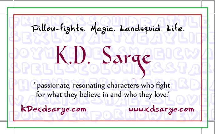
I dunno. Maybe it’s too simple, maybe it’s too…unfocused. But here’s what I worked up tonight. The green line is the bleed line, the red the trim line, and the blue (which I seem not to have had show up, oops) is “text safety.” XD
What do you think? Too much? Too little? More squid? (I tried to put squid on. It just didn’t look good. Alas.) (I need to blur the writing behind the writing some more, or fade it or something, don’t I?)

😮 I like it.
Ooh, I like it! I like it!
Shiny! 🙂
Thank you! I’m told, though, that the background that doesn’t look great online will look very bad printed, so it goes.
Eee, business cards! ^_^
I agree on taking out the background. I’m not completely sold on the font face for your email and website. I think I’d want those two bits of information to be crisp, clean, and clear; might want to lose the fancy font.
The fancy font for your “Pillow fights […]” line is fine for me, though. ^_^
I think it is missing some graphical touch, though. I, uh, wish I could describe what. Some vector art or accent, maybe?
What squid picture were you trying to use?
It’s actually the same font–I didn’t want to use four fonts.
I was just trying to use that little font-squid I made. The one in this post. http://www.kdsarge.com/wordpress/archives/4437 But nothing I did made it look good. I could always draw a very amateurish squid, but y’know…
Definitely like what it says (although I’d have no idea from looking at this that sci-fi is part of your repertoire), and I like the fun handwriting font, but it and the elegant font you used for your name clash, I think. Though it might clash less with the bubble-letters no longer behind it, I’d have to see it to be sure. (Also, quote is slightly off-center– just enough to make me twitch.)
I could try drawing a somewhat amateurish squid? >.> Cartoon? Silhouette? Lineart? Rainbow?